 |
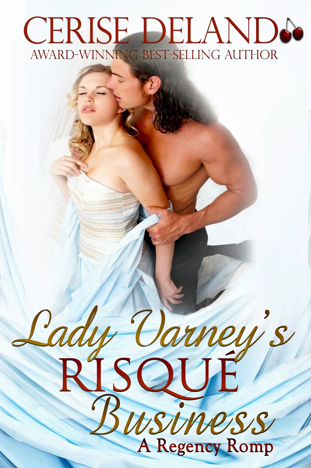
| My new branding look and re-release of best-selling LADY VARNEY'S RISQUE BUSINESS |
Do you like the feel?
The colors?
The white space?
Yes, my own cherry logo, too!
This cover debuts my new branding look for my Regencies, a process that took me a long while, spending (gulp!) HOURS in stock sites.
As a former PR and Advertising exec and owner of my own business for more than 20 years, deciding on a new branding look was one of my first priorities for reissuing Regencies whose rights had been returned to me recently. Yes, I will self-pub these.
Why?
I wanted to experience the opportunity to create one look, one brand, one market outreach that would (hopefully) place me in the minds (and hearts) of Regency romance readers.
When you write for a house, they decide the covers. With a series, the artists in house do try often to give you an individual look, but not always.
Defining yourself across different publishing platforms creates the challenge of giving readers a look to search for and immediately identify as this author's or that.
Too often too, I find that certain graphic designers who are popular are giving their clients within a sub genre the same kind of look. For Regency, we often have the house in the background or the landscape indicating a manor.
Here, I wanted a look more sweeping, brighter and in keeping with the fact that my Regencies are very sexy and have been, by nature of the houses that published them, considered erotic. Indeed, I hold forth that mine are very similar to many historical romance novels. While that is for the reader to decide, I nonetheless wanted to position my novels as close to those. And this is the result.
What do you think? Would you pick up LADY V. and what would you expect the story to be from looking at the cover?
No comments:
Post a Comment